A. Film
B. Press
C. Outdoor
D. Radio
E. Film Craft
F. Design
G. Interactive
H. Creative use of Media
I. PR projects
J. Marketing Services projects
K. Advertising Campaigns
F-1-21. Magnitogorsk - the meeting point between Europe and Asia
| Agency | Graphic design studio DEZA |
| Creative head | Alexander Suvorov |
| Author of idea | Ilona Koltynyuk |
| Product | New image of city Magnitogorsk |
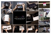
| Description | The main objectives while developing new style of the city of Magnitogorsk were escaping a stereotype «Magnitogorsk — the city of metallurgists». Magnitogorsk today ? is an innovative Magnet aspiring to dynamic development, ready for experiments and the modernization, opened for effective cooperation with investors. Here the comfortable conditions for self-expression, the realization of professional and personal potential are created. The city of Magnitogorsk has a unique geographical location — the historical border between Europe and Asia divides it into two parts. The city Residents and the city visitors daily, crossing the river Urals, travel from one part of the world to another, without leaving the city territory. Magnitogorsk, having been created by people of 32 nationalities, contains today representatives of 92 nations. Having united culture and traditions of these people, their history and achievements, the city represents a unique national and geographical alliance. The new brand became its reflection: «Magnitogorsk — the meeting point of Europe and Asia». Concept of new style of the city of Magnitogorsk: It is a style of the young, dynamic, developing city - the city for its residents, guests, investments. It is the city - for work and for rest, for creation and for pleasure. It is an open, modern, vigorous image facing the future. The continuous pulsing line fulfilled with color is taken as the basis of a sign. It is a symbol of creation, indissoluble communication, a way, live palpation of a rhythm, pulse. The live line also can accept different forms and outlines. It is very simple, but it is evident and contains at once a number of intuitively read out associations. Associative images of a sign: — the bridge connecting Europe and Asia — the bridge connecting the industrial and inhabited, social city — musical rhythm — pulse of the young growing city and its residents The line is basic element of the whole corporate style, without being limited only by a logo. It can draw any outlines; it is possible to express any forms and contents by means of the line. It easily adapts to any carriers and surfaces. With this graphics it is easy and convenient to work further on. Thus, the corporate style is dynamic and flexible and keeping its recognition can develop widely. Using the additional elements made by the firm line, there is a possibility to diversify carriers/supporters of a corporate style and to give them a wider range of emotional and semantic characteristics. It is symbolical that color of the bridge - meeting point between Europe and Asia - is created by merge of two other colours of a logo. Only in combination, interaction and commonwealth something new, evolutionary is always born. In commemoration of emergence of a new logo of the city the Ginnes's record on rope pulling through symbolical border of Europe and Asia was established by its residents. |
| Team members | Art director: Irina Schmidt Design: Nastya Zhukovskaya |


