A. Film
B. Press
C. Outdoor
D. Radio
E. Film Craft
F. Design
G. Interactive
H. Creative use of Media
I. PR projects
J. Marketing Services projects
K. Advertising Campaigns
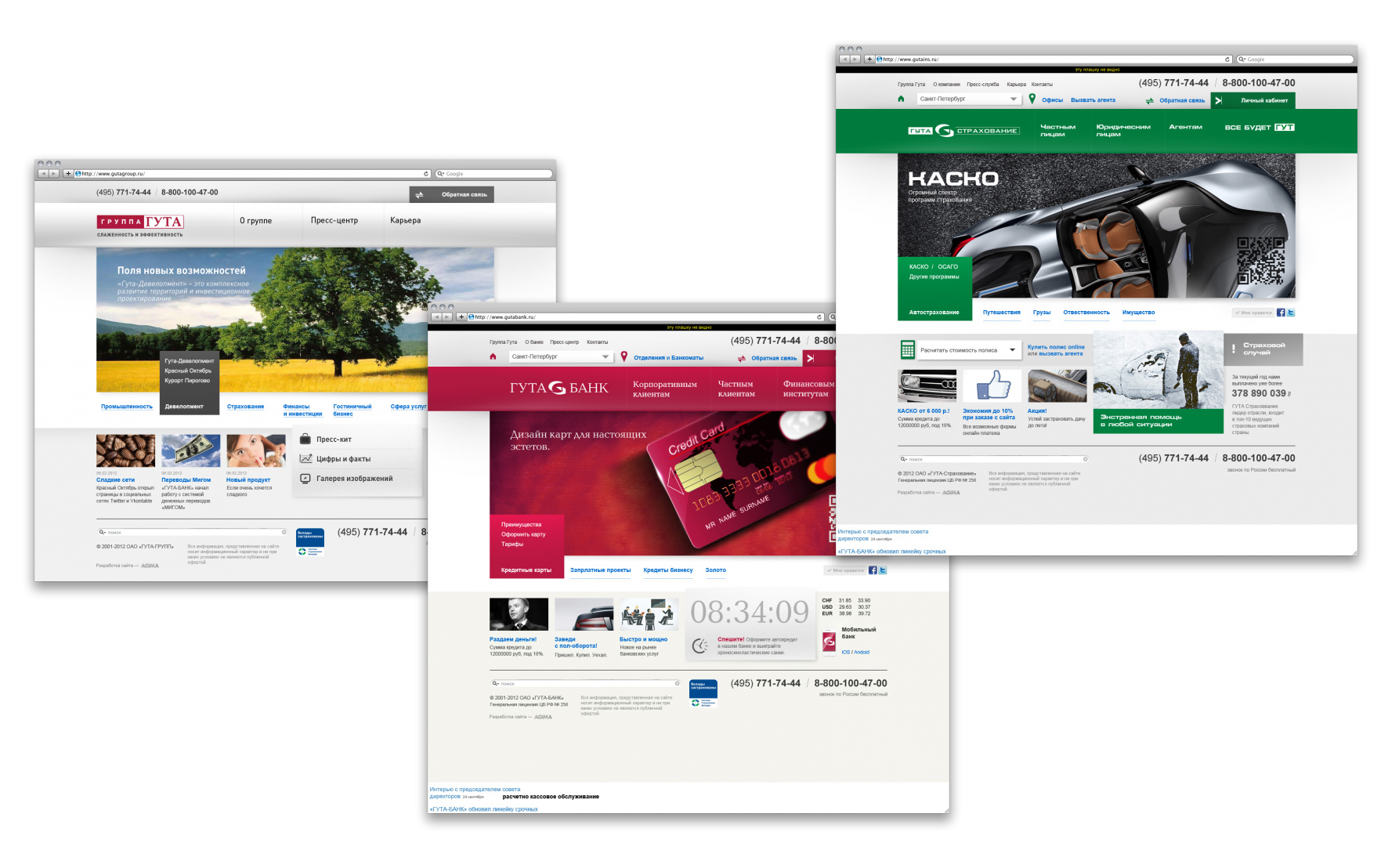
G-7-15. Holding GUTA Visual Language
| Agency | AGIMA |
| Creative head | Alexander Bogdanov |
| Author of idea | Grisha Kochenov |
| Product | Financial, insurance services |
| Description | The GUTA holding ordered in us design of sites for the main companies entering into its structure. Need of visual association by their uniform concept became the purpose of simultaneous processing of existing sites of business complexes to inform to clients of holding information of the companies among themselves and their indestructible communication. Starting the solution of this task, we went a little further. We began work with GUTA visual web language formation – only this way we could reach unity of structure and navigation of all sites. Visual language – system of rules of a uniform approach to the organization of dialogue of a brand with the user in a network some kind of Benbrook, adapted under a web. It contains the developed requirements to design of the sites united by the general brand, to their navigation, structural grids of sites, to the sizes of fonts, visuals, to firm flowers, etc. In Russia popularity of visual language only grows, while our western colleagues use long ago this technology. As an example it is possible to look at group of the sites BBC developed on the basis of visual language. So, we will look that turned out at us as a result of development of several sites of GUTA of holding: GUTA group, GUTA BANK, GUTA-Insurance. NAVIGATION All navigation is constructed by the general principles for all sites and shares on blocks (from top to down on models). 1st block: navigation according to the section "Company". Here we presented all sections providing necessary information on the companies, their structure, vacancies, etc. The 2nd block contains active user references: geotargeting, private office, feedback and all main interactive modules. 3rd block: main menu of services of the companies. Settles down on the branded color die and is the basic recognizable element of group of sites. COLOUR We argued color stylist for group projects. Banners, dies and some elements of a brand change color within the uniform concept. There is invariable a light background, color of references and the standard text. TYPOGRAPHICS We created uniform typographic for sites. The GUTA firm fonts – are atypical for a web therefore the area of their application is limited to the main menu and advertising promo-materials. For all other text the body type for a site – Arial in fat and usual tracings is chosen. GRID Better to understand that itself the pixel grid of a site represents, let's look at Parthenon. Strict proportions and study of details to the smallest details made this masterpiece an immortal standard which architects of the whole world still adhere. Like architects, we decided to create a uniform framework for all sites which became a pixel grid. We chose option of splitting of a content of projected pages on standard columns 464px/336px/144px which we will use on the main and internal pages of sites. The scheme 3 columns are universal, well recognizable and visually available to perception therefore well is suitable for classical business sites. STANDARD ELEMENTS We developed a uniform format of display of pictures and videos. Established the recommended proportions 16:9. Thus the size of blocks can vary within a grid. Text blocks (news, services) are organized on a vertical and horizontal grid with a step in 8px. The distance between the image, the text and heading not less 16px is thus set. Thanks to a grid, on all sites of GUTA group of companies the general logic of navigation is traced. Users of bank will quickly orient on a site of insurance company and on the contrary – the uniform structure allows keeping not only external recognition, but also the general organization of submission of information, one site is guessed in other. This decision is actuality for the companies which have the branched-out network of branches and want to develop uniform style of communication with partners and users. Uniform visual language offers to GUTA group sites certain advantages: 1. The unity of navigation and the general structure of sites will allow clients to find with ease the necessary information on sites, and it will give the chance to branches of the company to exchange client bases with each other. 2. Growth of recognition of sites of GUTA will be directly proportional to trust growth to a brand that, in turn, will entail inflow of users and will affect increase in sales of all business complexes of group. 3. Further web development of all resources considerably will become simpler. Being guided by visual language, designers can create any additional versions of sites or models of pages, without breaking the uniform concept of GUTA. |
| Team members | Grisha Kochenov-creative director; Alexander Bogdanov-head of AGIMA |