A. Film
B. Press
C. Outdoor
D. Radio
E. Film Craft
F. Design
G. Interactive
H. Creative use of Media
I. PR projects
J. Marketing Services projects
K. Advertising Campaigns
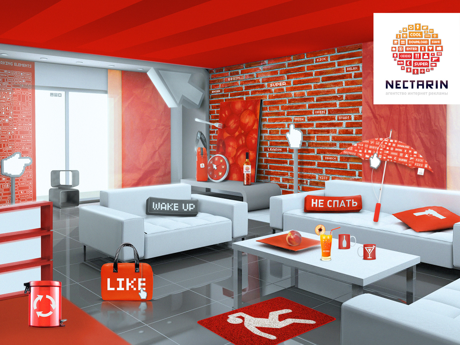
F-1-1. The “Nectarin” agency's corporate identity
| Agency | Nectarin |
| Creative head | Nina Yakusheva |
| Author of idea | Denis Shapkarin |
| Product | Nectarin Agency |
| Description | Everything started with the idea that “The world consists of buttons”. These are the words to describe the basics of the “Nectarin” agency's corporate identity. On the Internet, the center of all users' activity, which is more or less related to advertising, has to do with clicking and pressing buttons. This may include clicking-through banners and links of contextual advertising, or sending e-mails and completing profiles or registrations, or trading activities. Taking a closer look at the components of a logo, you notice that one way or the other each of the buttons expresses positive feedback and – through this - the effectiveness of brand advertisement, which both client and agency diligently strive for. The next step of corporate identity development was the ideological unification of a literally “fruity” company name with its motto «people swallow information». The result was a laconic analogy between media consumption and food consumption, which is vital for everyone. Right there in the brandbook, resembling a fruit in its color, all information unwraps as a restaurant menu, where freshly squeezed juices, nutrititious and tasty, are served. Hence, there is an indirect association with benefits that the agency brings to its customers. |
| Team members | Creative director – Nina Yakusheva. Production – Nectarin Agency. |